
In the last year, Ipai has reached many milestones and developed from an ambitious lighthouse project in the state of Baden-Württemberg into a professional company with great members, partners and initial offers. During this process, we created new offerings, developed strong partnerships and, with Ipai Campus, developed a vision with great appeal for the future AI hub in Europe.
Ipai has also developed further in terms of content and learned a lot about itself. In the course of this process, we realized that the face we gave ourselves at the beginning of the journey no longer matched what Ipai wanted to convey to the outside world in terms of ambition and charisma.
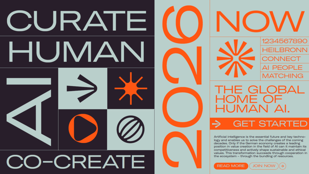
With the new brand identity we would like to live up to this claim and reflect Ipai’s core themes — Human & AI. The result is a design that reflects the visionary character of Ipai, creates identification and recognition value, but at the same time addresses the core — the human factor — with a closeness and humanity.
Our new logo is inspired by Ipai’s home and vision — the campus, which is reflected in the new basic shape of the logo. The inward lines describe the dynamics that Ipai wants to bring to AI transformation, creating a focal point that describes the coming together of the various stakeholders and interest groups.
Eventually Ipai becomes — IPAI. It stands strong in the room and shows a new self-image.
With a balanced color palette of warm primary colors and strong highlight colors, we create an appearance that conveys the visionary but accessible character of IPAI to the outside world and at the same time creates identity and recognizability.